Search This Blog

Sunday, April 29, 2012

Random Snaps: Malibu Waves

I've never really focused on photographing the details in waves as they crash so I walked the beach to do just that this weekend. Here's what I got....-cg


Saturday, April 28, 2012

It's Black and White: Part 3...Post Processing

It's Done in Post:
With Digital photography, B&W photography has really become more of a post-processing technique rather than a "straght out of the camera" method used in B&W film days. As I've mentioned before, even if I plan a photograph to be black and white as a final product, I still shoot every single photograph in color with the idea that I will make the right contrast and tone adjustments in Photoshop. I do beleive this has become the norm in the industry.

I currently use Photoshop for nearly all my B&W conversions in post processing. Having used Photoshop since the early Photoshop 4 days, I've become well versed in some of the more advanced aspects of the program. But it's the simplest use of Photoshop that is most fun to use.

Converting a color image to B&W is one of those simple things I do in Photoshop everyday. The process behind it is much more than a simple conversion however. It's in post processing that B&W photography can really become fun. Photoshop gives you tools to edit, enhance, or remove contrast and tones. Despite this, remember, it's always more simple if you've done the job right using the camera first. Your workflow, in general, will be much easier if you've created the conditions prior to post production that allow you to simply convert to B&W without the tedious editing.

Below are three images of the same scene I recently shot. The first is obviously the color version, but the second and third images are both black and white using different post processing steps. There is a difference between the 2nd B&W image and the 3rd B&W image.


This version has simply been Desaturated in Photoshop.

This version is a little more advanced, but the result is a "true" B&W image without the grey tones. Only Black and White.


So for those who use Photoshop, here are the recipes for B&W conversion technique shown above, both of which I use. One is the most basic way to turn an image B&W, the other a more advanced "true" way to make an image black and white (I will explain).

------------------------------------------------
Method 1: Desaturate

This is Photoshop's basic Desaturation command. One that is the most basic of Photoshop commands. All it does is remove all the color tones from the image, leaving you a B&W image with varying black and grey tones. Although it looks B&W, the grey tones in the image technically don't leave you with a true B&W image. Regardless, it's still the most used method in Photoshop to create the black and white effect and I do still use it on occasion.

Here's how you do it.

In the menu select the following (screenshot below). 
Image>Adjustments>Desaturate or you can just use the keyboard shortcut Shift+Ctrl+U.


Shift-Ctrl-U is the shortcut for Desaturate


That's it! It's super simple.

------------------------------------------------
Method #2: True B&W via Channel Removal

This is what I normally use. Granted it takes a little longer to do initially, you can make it take the same amount of time as the Desaturate command by simply creating an "action" in PS and assigning that action a keyboard shortcut. Personally, I've used this action I created thousands of times by just pushing F5 on my keyboard (of course, if you don't like F5 you can set it to any other key or combination).

The concept behind this is removing the tones found in the channels of the RGB data of the image. To do this you have to remove Channel A and Channel B from the image. Yes, this is a little more technical, but it's the way to get a true B&W.

Step one: Convert image from RGB to Lab Color (see below) in Image Mode.


Step 1: Convert from RGB to Lab Color

Step two: Go to Channels (next to Layers) and delete A and B Channels.


Step 2: Delete the A and B channels. Drag the channels to the trash can (shown by the arrow).


Step 3: Greyscale the image. Go back to Image Mode and select Greyscale this time. 


Step 4: Convert the Image back to RGB in the Image Mode once again. 


Step 4: Convert the image mode back to RGB Color.


And there it is. A true Black and White image. Feel free to email me any questions or suggestions for future discussions on Photography and Photoshop as well. I would like to answer any questions in future blogs. I still have to go into my personal tips for B&W photography...until next time! -cg

Saturday, April 21, 2012

West Coast Champs...04-20-12

This morning I photographed the Pepperdine Womens Soccer team at Point Dume. They won the West Coast Conference Championship in 2011 and wanted to remember the event with a beach photo shoot. Pepperdine University is one of my favorite clients in Malibu, so naturally I accepted the assignment when they called.

It was a rather foggy morning but by 8am the fog was thin and the cloudy sky allowed for near perfect lighting conditions. The diffused lighting provides an ideal condition for shooting large groups of people...it's my favorite type of lighting for this type of photo shoot. Congrats Waves!


Tuesday, April 17, 2012

It's Black & White- Part 2

Contrast is the key to good black and white photography.

Contrast in a photograph leads your eye to the point of greatest interest; which should be your main subject. It brings together the points where the lightest and darkest elements converge. It is the element that creates texture and depth in a  B&W photograph. The result is an image with impact. For this reason, I believe contrast is the single most important element of a good B&W photograph.

Without it, our eyes get lost and our mind is confused, so the photograph becomes less impactful. But with too much contrast, our subject can become a distraction itself. So it's a balance.

So how do we do this?
The key is lighting. It's the facilator to creating impact in your B&W photograph. Lighting allows you to create shadows. And how you light your subject has a direct effect on all of the elements that will make your photograph good- shape, contrast, pattern and texture. The proper use of lighting, especially along edges combined with good contrast is an especially good opportunity to express details in a photo. I often use B&W photography to express these details at weddings. The image below is an example.

Because there is good contrast in this photo, black and white creates the impact needed for this image to work. In color, the bubbles simply blended in with the background. In B&W, the bubbles give the image the impact needed to make it an effective image.

For B&W photography, directional lighting from one key source is usually the best type of lighting for those elements mentioned above. Your "main" light source in general should be brighter and stronger than any other light in the scene. This creates a "ratio" of light to dark areas in the photograph essential to creating contrast and depth. A typical ratio would be 2:1, meaning your main light is 2 times stronger than your fill light. Directional lighting enhances shapes and increases contrast by adding highlights as well as enhancing textures and patterns.

None of these tips are only applicable in a studio. In fact, learning to use light in a natural setting to create texture and depth to an image is part of the art of photography. Look at the image below I shot of a bride in a limo during a wedding in Connecticut.

In this image, the light outside the window is the main directional light. It is a 2:1 ration to the light within the limo, hence the effective shadows and details throughout the image. Notice you can even see the raindrops on the window. 
In a studio, you control the ratio's using artifical lights, an art in itself if done right. Unfortunately, most studios now don't use any "ratios" in their photography. One of the barameters I use to evaluate a photographer is the photographer's use of shadows. Many bargain studios (think Sears or some school day studios) don't use any "ratio" in their photographs. Take a look at most of their work. No shadows. It's all even lighting (basically the easist way to shoot without risk of error). So theorically, most of those evenly lit photographs will not look good in B&W.

Always remember, that since photography is a two dimensional recording device, shadows and contrast are your only way to create the depth you need to add impact.

Despite all the post processing possiblities, it's still very important to plan your B&W photographs even though you are shooting in color. In my next discussion on B&W, I will lay out my favorite tips for B&W photography, plus a few of my own Photoshop techniques....-cg


Monday, April 16, 2012

Random Snaps 04-15-12...and a Rainbow.

So along with my educational blog posts I do want to start a "random" series to keep me motivated to photograph the beauty around me. So here is my first random snaps entry.

Gotta Practice!

I took a walk on the beach again to practice photographing birds in motion in preparation for my African Safari. So here's just a few randoms from today.

Oh...and speaking of random I'm including a quick snap of a rainbow I captured when I got home on Friday evening after an evening storm.

I really wish I could have been a more scenic location in Malibu for the rainbow, but I wanted to share it regardless. Maybe I will write a blog in the future on how to improve your rainbow photography! :-)-cg


Rainbow over Malibu on Friday 04-16-12.


Thursday, April 12, 2012

It's Black & White- Part 1

A really good friend of mine asked me recently, how I determine whether a photograph is going to be black and white or whether it's going to be in color.

This got me thinking about my own process and whether it's something I actually determine before I take the photograph or after I've pulled up the image in Photoshop. That thought then led me to realize that I often catch myself not shooting enough black and white photos in the same sense as I used to in film days. 

Now inherently, every photograph I take is in color out of the camera, so when I say "shooting black and white photos," I'm talking about shooting a subject with the idea that it will be a black and white photo as a final print.

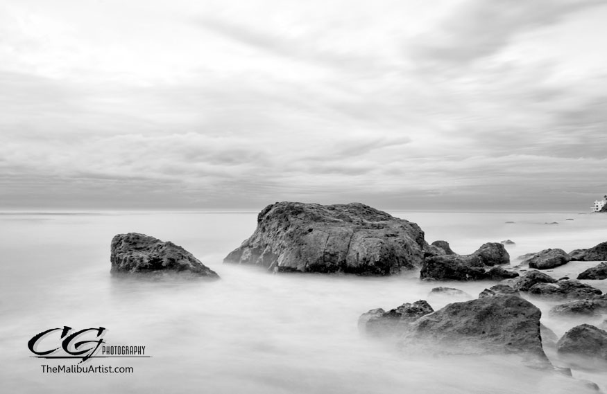
So for the purpose of this blog I want to discuss how I determine if I will convert an image to black and white in post processing software like Photoshop. Take a look at the photographs below. They are the same image. One in color. One in black and white. 

Which do you like better?


If you said the one in color, then you agree with me. But why? 

It's not just because the color of the field makes the photo warm and pleasant. It's because in color there is a clear separation between my subject and the background. The subject doesn't appear "washed out" in color because of this. There is depth to the image. In B&W, the black, grey, and white of my subject are too close to the black, grey, and white of the background thus making the image appear washed out. In color, there is clear separation that results in more depth. 

What I consider to be the general rule of thumb for determining whether an image will be better in B&W is this; when your subject’s black and white tones blend with the foreground/background tones, it’s a bad idea to make the image B&W. It's that simple. 

Now occasionally I will shoot an image with the idea that it's going to be B&W but it ends up just as good in BW as it is in Color. The reason for this are more to do with skin tones, color saturation, and a perfect balance of luminosity throughout the image. And a little bit to do with my lighting technique. When I know I'm going to shoot an image beforehand I want to be in B&W, I'm always sure to light my subjects in a way that separates them from the background. This means using a reflector to create a rim light and careful placement of the subject. 

The image below is an example of this. I just couldn't decide which was better, so I gave it to the client in both. You will notice that even though he is wearing a dark colored shirt, but in B&W image, there is still a separation between the subject and the background; that depth that is needed. Here I used a reflector and strategic placement of the subject to achieve this. 

Notice there is a slight "white patch" on near the subject's left elbow that creates a separation. It's very subtle, but place your finger over that patch and all of a sudden there is no boundary between the subject and the background. Kind of cool huh?..it's just enough separation to take the photo to the next level.  


 I can write forever about little details like the one above, however, I want to spend the next blog entry discussing Contrast and why it's the magic element to black and white photography. I also want to discuss some best practices and tips for Black and White photography. Hopefully this weekend I can get some fresh new examples to share....-cg


Saturday, April 7, 2012

Malibu Spring and a Fast Shutter

Today was a beautiful day in Malibu! Spring is in full force.  It was bright, warm, and hardly any clouds in the sky. A perfect day to shoot some high speed photographs and test some equipment before I fly out to Africa in a few weeks for my photo safari.

So I grabbed my camera and went to play.

Now when I say high speed photography, I'm referring to shooting with a very fast shutter speed. Since it was really bright out today, the conditions where very good for high shutter speeds. It was a good change of pace for me since I don't often shoot high speed.

Here are some shots I got and the specs behind them....

The Heron above was shot in Manual Mode at: 400ISO F-5.6 and 1/2000 sec.


This image was shot using a panning method with the following details. Manual Mode,
400ISO F5.6 and 1/1000 sec. 


The images of the birds where quite challenging actually. I'm testing out a new lens I bought to use on a second camera body when I go to Africa; the Canon 70-300  IS lens. I used this lens today and I was happy with the test results.

Most of my shots today were of birds. I quickly learned that if you want to capture the bird in mid-flight you better be using a fast Shutter. Now you can probably notice that I shot at 400ISO and 500ISO. The reason for this is that the extra ISO speed allowed me to use an even faster shutter speed.

Remember, a fast shutter speed allows less light to reach the camera's sensor because the shutter opens and closes so fast. The higher ISO gave me the ability to speed up my shutter speed, but at the sacrifice of more grain in the image. Grain doesn't bother me these days because most higher end D-SLR's now shoot up to 800 ISO at very acceptable standards.

On my walk back from the beach, I came across a patch of spring flowers. Of course, the flowers where beautiful, but what caught my attention were the bees that were hovering around them. I was pleased with the test image results of the bird photos so bees seemed like a real test. After all, they are tiny and they move really fast. So for the next 20 or 30 minutes I photographed the bees. And since I was practicing my high speed work, they made perfect subjects.

Here's a series I captured....


All of the photos above where shot with the Canon 70-300 IS lens. The images where shot at 1/2000sec, F-7.1, and 400 ISO.

As you can see, even 1-2000sec is not enough to freeze a bee's wings in flight.

It was a fun afternoon of actually playing with my camera and lenses and not necessarily "working". Hopefully these images will inspire you to go play with fast shutter speeds and the season of Spring! -cg


The Rock. Sunset at Point Dume

Yesterday, I went to Point Dume to catch sunset and maybe a glimpse at a whale or two in migration. It was a rather breezy evening there, but as I've said before, I think it's the best place to catch sunset in Malibu. This time though, I really wanted to focus on getting an image of the actual point of "The Rock" (as I call it).

Earlier in the day I looked through some of my files of Point Dume and realized that somehow I'd never shot a photo from the beach. I've always been so consumed with the view from above that I neglected the beautiful beach below. 

So this time I stayed on the beach for a different prospective and partly because I have a knee injury that prohibits me from climbing or hiking. 

Point Dume: 
It's an iconic place. For anyone who watches TV and has also been to Point Dume it's the location for countless TV commercials and really just about any movie that involves the beach somehow ends up using Point Dume or Zuma Beach. Probably because it's so beautiful and has so much sand many sets and backgrounds can be built. And as a photographer, I can attest that the lighting there is great. Point Dume's popularity in film was probably first made in 1968. It's the location of the iconic image of the Statue of Liberty buried in the sand by the beach

Anyways...enough history. Here's the images I captured from below. -cg


Thursday, April 5, 2012

A Prospective on shooting RAW


Do you shoot RAW?
That’s always a question I get asked when I’m in the field. It’s a great question actually; one that makes me stop and think about how I will answer. My answer is always the same. 
The truth is. I have a love/hate relationship with the RAW file format. It’s not that I don’t like it, or that I love it, it has more to do with the fact that there are only 24 hours in a day. And converting RAW files to jpegs or tiffs takes time!
But before I explain my workflow when it comes to RAW, I want to visit what RAW is to begin with.


RAW
RAW files are so named because they are not yet processed. The purpose of raw image format is to save the maximum amount of data from a digital sensor with minimum loss of information including the conditions surrounding the capturing of the image. In simple terms, it’s the highest quality of image and data that can be compiled by your camera’s sensor.


RAW images can’t be printed or viewed until converted to conventional file types (like jpeg or tiff) using specialized conversation software usually distributed by the camera companies. 


RAW files as basically the “digital negative” of your photograph. And similar to film, the negatives can be fine-tuned in the darkroom because negatives hold all the original image data. In the case of RAW digital images, you can recalculate the settings in the camera at the time of taking the photo and essentially "retake" the photo using the new settings including the color temperature in the white balance.


Think of it this way. RAW is just like film before you take it to get processed. The only difference is that the software (and you) are doing the "darkroom" stuff now. 

RAW allows you to get the most out of your camera; but at a price. Because it’s uncompressed and therefore unprocessed, it means that the file size is a lot larger than a jpeg due to the fact that it’s holding so much information meaning there will be costs associated with both time needed to convert the files (if you are professional) and storage costs. But if you are going to be printing large photographs RAW is the way to go for quality reasons. 


This image was converted from RAW to jpeg after fine tuning in Canon Photo Pro Software. Everything from white balance to shadow detail to exposure (2 stops) can be recalculated by shooting RAW. 

I normally shoot large JPEGS when I'm shooting regular everyday photographs. I say "large" because every camera has a setting to allow for smaller sized files. My take is that if you own an 18 megapixel camera there is no reason to shoot smaller sized jpegs. After-all, a big reason you paid so much for the camera is partly for those extra pixels. 

So how do I determine whether I should shoot RAW? Simple, it depends on the situation and the type of photography I am doing. Quite frankly, I'm confident in my ability to expose an image properly or at least closely enough to "right" the first time. Consequently, I shoot JPEG most of the time. BUT for most paid assignments or photo shoots I do photograph my subjects using RAW settings.


For Fine Art, RAW is a must. When you combine the post processing abilities of RAW with your photographic expertise such as proper F-Stop, Aperture, ISO the possibilities in post processing are endless. Here is an example from one of my signature ART pieces.


The advantage of using RAW in Fine Art is that every extra bit of data in the image is retrievable using the conversation software. In this case, the details in the dark areas where recorded in the original image and I was able to extract that detail before processing the image. Once the image above is processed I can import it into Photoshop and make any adjustments within the converted JPEG.  


I do prefer JPEGs to RAW when shooting general stuff and most portrait shoots. Again, most of my preference is due to the my confidence in shooting it right the first time. The biggest factor for me is time. Because RAW files take so much time to convert, it can get quite exhausting.  


PROS to Shooting in RAW:
  • Data. All that information stored in RAW images allows you to utilize all that information to get the most out of the image.
  • RAW allows you to alter any errors in exposure (usually up to 2 stops and slightly more) and make corrections.
  • The data also allows you to use the maximum amount of post processing abilities prior to editing in Photoshop.
  • RAW also allows you to go back and try different camera settings and basically reprocess the image using custom settings prior to importing into Photoshop. 

CONS to Shooting RAW:
  • Very large files, so storage can be an issue and you will fill up CF cards faster.
  • You have to process the images before you can share, or edit them in Photoshop. 
  • Time. It takes time.
  • You need additional software to convert.

PROS to Shooting JPEGS:

  • Files are smaller and therefore more of them fit on a card.
  • For most purposes image quality is more than sufficient (family snapshots, news images).
  • Many photographers, like myself, don't have the time or inclination to post-process their files if it's not a paid assignment.


One quick note on JPEGS: 
Please remember that if you use Photoshop, as great as it is, it has it's limits. If you shoot JPEG's you are recording the image as you shot it. So you can't recalculate (or digitally retake) the image in Photoshop because you are limited to the data stored in the JPEG (which is nothing close to what's in the RAW file). Photoshop merely manipulates the data you recorded in jpeg form.

So when people ask me what I prefer. I say it depends on the situation. For example, if I'm shooting a wedding, I shoot the most important shots (the kiss, portraits, other major events during the day) in RAW. Shots before the ceremony like the bride getting her hair done and the groom I normally shot in JPEG. This is all in the name of time. It's my personal way of doing things. 

For anyone starting out with Digital SLR's, I always recommend if you can learn how to shoot RAW early in the learning process, it will help you greatly in the learning process all around. -cg